Every application has essential elements that together lead to great user experience. Information-heavy network applications are no exception here. Yet in many cases their usability is poor due to technological debt or lack of UX expertise during the design phase. In this blog post I will highlight UX best practices in designing applications for network monitoring that will enhance user experience.
Navigation
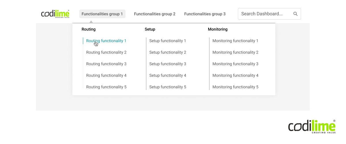
The very first thing a user appreciates in an app is its smooth navigation, the real backbone of sound user experience. This UX design principle is especially true when it comes to complex network applications where a user has many advanced functionalities and must deal with information overflow. These functionalities are often located in the app menu. When you want to find the one you need, you must scroll through the entire drop-down list, which can take half of a screen. The search bar does not really help, either.
To solve this usability issue, before creating a menu with all these functionalities, it is good to categorize each of them. The categorized elements can then be placed in sidebars or topbars and you’ll have navigation based on the Category > Functionality principle, which is much easier for users to navigate.
As for the search bar, remember two things: place it in a visible location and mark it with text (e.g. “Search for X”) or an icon. If searches are to be performed in the entire application, a search bar should be placed at the top of elements to be searched following a simple Gutenberg Diagram rule of reading from left to right and from top to bottom. The resulting visual hierarchy will represent the application’s logic.
UX best practices for navigation
- Menu based on groups rather than single functionalities
- Functionalities placed in submenus or in top- or sidebars
- Search bar location marked by text or an icon

Fig. 1 Search bar
Input fields
An application’s input fields are used primarily for entering or choosing data. What elements make an input field great from a UX point of view? First, it is easily accessible and has an appropriate label that allows the user to verify what data have been entered in a particular field. When it comes to network applications, there are three main types of input field: for entering data, for choosing data from a list and for choosing a data range (from-to).

Input for entering data
The first type is used to enter data that have not been predefined in an application, e.g. user name and surname when signing up or a template name to be used for a saved dashboard. Even if the data are not predefined, you can use the autofill or autosuggest function based on the data users enter.
A label and input bar should be visible whenever an input field is active or a user has started entering data. This will be helpful for users coming back to edit a form that has previously been filled out or to pick up work where it was left off.

Fig. 2 Input field for entering data
Input field for choosing data from a list
In this case, data are predefined and the user can choose them from the list. They are used to choose an action belonging to a particular functionality. It is good practice to create an option to add a new list element that the user considers to be lacking. After clicking on the input field, the user should be informed that this is a list with data to choose from. It is also recommended to use an arrow showing in which direction the list is expanded/collapsed. It is more natural for the human eye to follow gravity, i.e. from top to bottom. Therefore, lists should be expanded downwards and collapsed upwards.
You can also add an option to sort dropdown lists based on the user’s choice. Such lists can be sorted alphabetically or based on recently used data. You can also go a step further and put them over other elements from the list.

Fig. 3 Input field with a dropdown list
Input field for choosing a range of data (from-to)
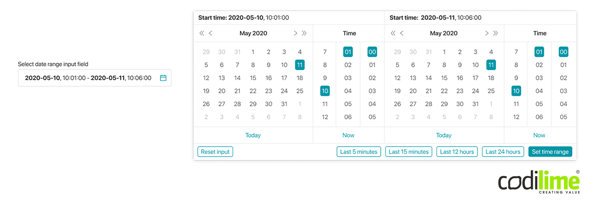
This type of input field is often used when entering the time range for which data should be displayed. This input can be split into two separate fields for entering “from” and “to” values. These values can also be shown in a single field with a separator, labels and icons showing the type of data being entered, e.g. days or time. When you click on the input, the time range field should appear below it. You can also add a button icon to visually represent data to be chosen (e.g. calendar, clock, etc.). After clicking on it, you should see the modal window to choose the entire range.

Fig. 4 Input field with a range
UX best practices for input fields
- Proper data formatting
- “Last used” quick filter buttons
- Selected data is always visible
- Reset button

Fig. 5 All types of input fields
Data graphs
Graphs are an essential part of information-heavy applications for network monitoring. The first thing that comes to mind when you think about a good graph is its readability. To enhance it, you can add the option of selecting lines and opening it in a full-screen mode, an option often used in the admin rooms.
When working with complicated graphs, it is good to be able to select a part of a graph that can be zoomed in on for more details. Dashboards can contain many graphs with tons of data. In order to display all of them, the size of the graph widget must be pretty small. However, such graphs are prohibitively difficult to read, especially when the data range is very broad and the screen resolution small. Adding zoom-with-selection functionality is the right solution here. Users can zoom in on selected graph areas for the details they need.
It is also worth noting that network applications are often used by large and distributed applications teams. According to research conducted by CodiLime, adding an option to create a hyperlink for sharing a graph improves communication among such teams significantly and thus increases overall user satisfaction.
Finally, add the functions users find particularly useful. These include counting average values and trends displayed on the graph, editing how input data are displayed, grouping and filtering.
UX best practices for data graphs:
- Option to open a graph in a new window
- Selecting a chosen line on the graph
- Zooming in on a selected part of the graph
- Sharing a graph/dashboard with other team members

Fig. 6 Data graph with additional options (full screen, select a line, zoom in, share)
Summary
As you can see, good information architecture is essential for positive user experience in information-heavy network applications. UX designers should bear this in mind when designing a user interface for such applications.


