Developing complex network systems dedicated to network professionals is a huge challenge. Well-designed software will make your everyday work faster, easier and more enjoyable. An outdated UX design, on the other hand, can significantly decrease your productivity and result in errors when you’re using the system. If you are planning UX strategy for your product, read our blog post to see what guidelines you should follow. They’ll help you provide the best user experience in network applications and also avoid errors.
Make creative use of UX best practices
It is always good to follow UX best practices while designing complex network systems. Applying well-known schemata will allow you to create a consistent user experience across the entire product. Yet don’t limit yourself to following these rules blindly. To design a product that stands out among other similar products, be creative. To create a new and fresh design, talk to shareholders and business partners, analyze your competitors and take informed decisions based on data and not merely on your intuition. Your UX strategy shouldn’t be limited to the one-time creation of a good product, but should aim at developing it over the long term and based on an iterative process.
Analyze your competitors
Good intuition is always welcome, and all the more when it’s backed by solid evidence gained by researching solutions available on the market. Keeping abreast of what your competitors are doing will help you find the right benchmark for your design and avoid reinventing the wheel. On the other hand, you will be able to find the drawbacks of competitors' solutions and focus on solving them. Thus your product will stand out by providing features your competitors’ products do not.

Be consistent
A complex network system is not only about features and actions, but also visual language. Following the simple rules of good UX design combined with technical innovations will help you create a clear and neat UI that end-users will take pleasure in using. Visually consistent and aesthetically appealing software is a clear sign that its development has taken UX design principles seriously. Being consistent across the entire product, using a properly organized visual hierarchy, ensuring that elements are well placed on the screen—these are the crucial elements that help users to get the message, analyze it and take necessary actions. A user should always know precisely what a given message means, so make your visual language consistent.
Make it visual
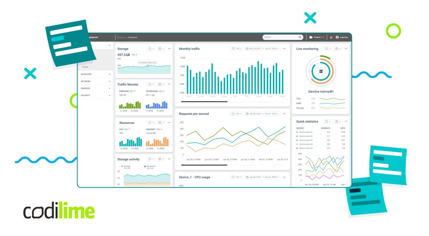
Network applications generate tons of data that need to be analyzed quickly. The analysis should produce actionable insights that a user should be able to put into practice immediately. The brain processes visual data 60,000 times faster than it does text. It therefore pays to visualize data or information so that users can find and analyze it quickly. Think charts and diagrams here. You should also create visual representations of important information by sprinkling in heatmaps, switches, icons, and colors to let users know they’ve performed an action properly or need to quickly react to errors and alerts.

Take data under control
A properly designed tool to explore data should have two characteristics. First, it should help users analyze the data. Secondly, it should navigate them towards the results they want to obtain. Not only do users want to have a statical overview of the data, but also to interact with them, in real time, if possible. Data should be visualized so it adapts to the users’ actions and allows for an in-depth analysis, which is the ultimate goal of every data tool. To achieve that goal, follow the three-step process by Ben Schneiderman:
- Data overview
- Zooming and filtering
- Details on demand
Going from general to the specific is here the best path to gaining the insights you want from the data.
Personalize it
User experience is a very personal matter. It incorporates individual experiences with the application, emotions, actions, usability and performance. Each user experience is highly subjective and changes dynamically. You should therefore do your best to customize the product you’re designing to the needs of a particular user. Make good use of such features as customized dashboards, saving settings, creating customized filters, choosing data for reports, analyzing diagrams and charts by choosing required data and creating customized critical categories. All of these will greatly enhance the user experience of your application.
Know the difference between UX and UI
UX and UI are two different things. UX is about how the product works and how the end-user interacts with it. The user interface dictates how the product looks aesthetically. When designing your product, you should know the difference between them. Sometimes you may just want to have an aesthetically refreshed web page, and simple UI mock-ups will get the job done. Sometimes, a complete design of how your product should work is required. In that case, you’ll need to create a clickable UX prototype showing how every functionality works. In any case, to avoid problems at later stages, it is crucial to define your expectations before the project begins.

Don’t make it overcomplicated
Advanced network systems have numerous complex functionalities and present users with countless actions to be taken. This can be overwhelming and even make the system unusable. Too much information on the screen prevents users from identifying the most important information. Usually, users start their interactions with the product with a scan of its visual aspects. When headers are easily readable, navigation buttons are visible and important information is highlighted, users quickly find what they are looking for. Simplicity is the ultimate form of sophistication.
Don’t make elements compete for the user’s attention
Nobody likes being overwhelmed by notifications pouring in on the screen. Modal pop-ups, multiple actions to be taken simultaneously, numerous alerts—all these can cause a headache and users to abandon the application. Information overflow combined with a lack of proper information architecture looks unpolished and unprofessional. Your users know exactly what action they want to take and have already planned steps to do it. Your product should be designed to help them do it as efficiently and effectively as possible.
Don’t mess with information architecture
Information architecture is a key element of every UX project. If it is poorly designed, it breaks the navigation flow, makes you work longer and makes problems harder to solve. Properly designed information hierarchy combined with categorized and grouped functionalities and actions greatly improve navigation even across the most complex systems. As a result, the learning curve of new users will speed up exponentially in the first days they are using the system.
Don’t assume you know everything
It’s easy to assume that a good product should accommodate all users’ needs and requirements. Yet users often don’t know what they really need or if their needs can be realized technically. Their needs are not always rational or required for the final product to succeed. It’s therefore important to align user requirements, business goals and their implementation in the product itself. Be inquisitive and verify with users if they really need a particular functionality.
Combine different perspectives
Developers look at the logic and technical aspects of the product. They often use edge cases, i.e. extreme situations that rarely occur (e.g. the maximum number of users using the application at the same time). This allows you to clearly see your product’s capabilities and limitations. The end-user’s needs, on the other hand, aren’t usually that logical, so you need to carefully research what they really want. Only by combining these two perspectives can you design a truly great product that is at once technologically doable and capable of realizing users’ needs.
Don’t introduce too many changes at once
Introducing too many changes at the same time may ruin even the most carefully designed product, so don’t do it. Instead, change things gradually taking into account various factors such as technological limitations, end-user’s habits and limited developer capacities.
Don’t panic when you can't test your UX design on users
In designing great user experience, thorough research is crucial to discovering what end-users really want and appreciate. But what should you do when you lack access to your product’s future end-users. Don’t despair, for starters. Many UX problems and questions have already been described and converted into best practices and design principles. If you cannot verify your ideas directly, use them instead to make sure that your design applies the best guidelines and patterns available on the market.
Design, design, design
The path to mastery is always paved with practice, and UX design is no exception. So, after reading our best practices, put them to work in your real-life projects. Only in this way will you master them and bring your UX skills to the next level.


