A physical demonstration of your ideas is the best way to check if they really work. For investors, a clickable prototype says more about the product’s business potential than a wordy description. For your clients, user experience is a decisive factor. Read on to see how a UX prototype can help you develop your software product, even those destined for the most complex network systems.
What is a UX prototype?
In a nutshell, a clickable UX prototype is an interactive version of a product that allows you to show its functionalities and the user’s navigation flow in practice. In other words, it is a high fidelity prototype of a product, but without any backend. Having the visual design, you can see how a given functionality works in the context of the entire product and decide whether it makes sense to send it to developers for coding. The UX prototype can be a standalone project or a step in the overall development process of a Minimum Viable Product.
UX prototype business benefits
If a UX prototype is not a proper working product, why should you develop it? Well, there is solid business logic behind doing so.
First, a product idea may look good on paper, but in real-life scenarios may perform poorly. In software development, releasing a product to the market requires a considerable investment of time and money. If after the release it turns out that this product is not as good as it looked at the very beginning, the cost of failure may be considerable. A clickable mock-up of such a product prepared by the UX team could save you time, money and a lot of frayed nerves. It clearly shows which functionalities work and which do not. This allows you to verify your ideas, to correct or simply discard them without running up unnecessary costs. Additionally, such a verification can be done much faster than releasing an entire product, which may take several months.
Secondly, having an interactive UX prototype allows you to check how the designed user flow or features work in practice. You do not have to code anything, a UX mock-up is enough to verify if a given functionality will benefit your users and business. More importantly still, a UX prototype can reveal the problems and possibilities you did not expect to exist while you were creating the assumptions for your product. By simply clicking different features, you can check if the designed navigation flow is user-friendly and intuitive and also uncover the gaps that were not visible in the initial product requirements.
Last but not least, a picture is worth a thousand words. Even the most inventive description may not be enough to convince your investors to sink money into your product. It will be much more difficult to resist the appeal of a shiny UX prototype, which will prove that your concept actually works and can usher in considerable business benefits—if the proper funding can be secured.

UX prototype process
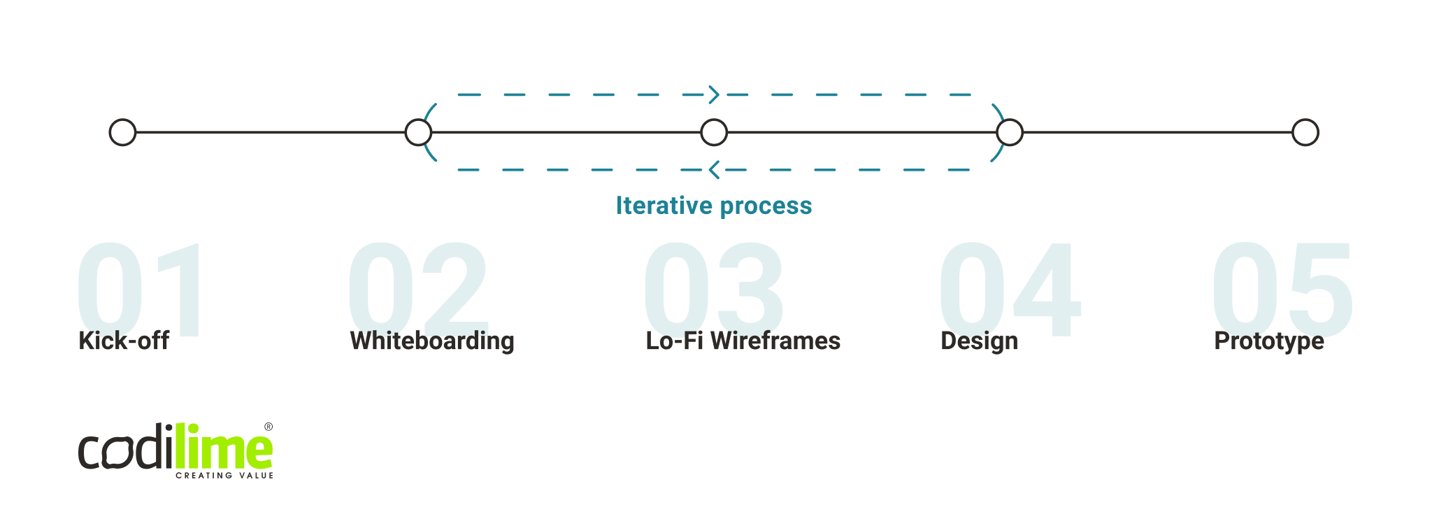
To design a successful UX prototype, you need a proper process in place to get things done. Here’s an example of one:
- Kick-off
Our design team starts the process by finding answers to three main questions: why is the product needed, who is it for and what are the main KPIs? While conducting research, brainstorming ideas and benchmarking the solutions already on the market, we focus on aligning user needs and business goals.
- Whiteboarding
Once the service/product brief is ready, our design team creates a quick reference navigation and an overview of the system. This is the way to evaluate ideas and identify possible pitfalls and dead-ends to avoid. Seamless user experience remains at the center of the design process, unwaveringly.
- Lo-fi Wireframes
The team now visualizes the possible solutions and evaluates them. Low-fidelity wireframes allow us to test different approaches to the layout quickly and thus save time. Lo-fi wireframes also present the perfect opportunity to conduct usability testing. You’re likely to get more honest feedback for a product that looks unfinished, as people are often reluctant to give negative feedback on software products that look complete.
- Design
It’s now time to focus on the visual side of the solution. The product should have a look and feel that will be pleasant to the eye while providing seamless user experience and navigation flow. Visually appealing products tend to receive even more praise if they maintain carefully designed information architecture.
- Prototype
The result of the previous stages is a high-fidelity, clickable mockup that gives the real feel of how the product will look and work. At the same time, it enables both us and the client to iron out any details that might have been overlooked in the previous steps. With a prototype now in hand, the development team can be given the full specification of what is needed on each screen (see Fig. 1).

Fig 1. UX prototype process
UX prototype for network applications
If the business benefits of creating a clickable prototype for standard applications (e.g. for banking or fitness) seem obvious now, the same cannot be said of complex network systems. You may believe that user experience in such software takes a back seat to high performance, security and scalability as the requirements that matter most. Yet, when you look closer at such network applications, it will immediately become obvious that this assumption is wrong from the outset.
Network systems produce tons of data, collect various metrics and have numerous advanced functionalities. Navigating in such an information-heavy environment is really challenging. It is sound UX design that can help enhance user experience in these complex systems and make their every day work faster and more effective. Customizable graphs and widgets, information architecture designed to improve readability, simplified views with more information on demand—all these elements will definitely bring usability to a new level.
In the context of designing a network product or service (e.g. an application for network performance management), creating a UX prototype offers considerable benefits. It will allow you to check navigation flow and conduct usability tests among network engineers that are its target end-users.
When you skip the UX prototype phase—use case 1
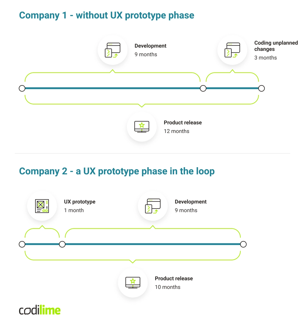
To better illustrate the benefits a clickable prototype offers, I’ll describe two hypothetical use cases. Company 1 wanted to create a network application. Time was of the essence as investors wanted the application released to the market as early as possible, i.e. after nine months. Company 1 therefore opted to forego the UX prototype phase, which would have tacked on an additional month. Company1 believed that it would prolong the entire process needlessly and insisted on starting coding immediately. They saw no reason to involve a UX team in the product design stage.
Nine months later, a developed application was ready to be presented to the client and released to the market. Yet the client was not entirely satisfied with the results, especially those related to navigation, user flow and data visualisation. The client requested many changes. Because there had been no time and space for the UX team to verify product requirements in the development process, these problems could not have been spotted earlier. It took developers an additional three months to code them, pushing back the product release to a full 12 months instead of the nine that had been planned. No wonder investors were so dissatisfied with the results and reluctant to sink more money into the product.
UX prototype phase in the loop—use case 2
Company 2 also had a network application in mind, but decided to involve the UX team and include the additional month a UX prototype would take to create. The development process was thus planned for ten months. A clickable UX prototype giving the real feel of how the end-product would look provided considerable benefits. It allowed Company 2 to verify if product requirements related to navigation, user flow and data visualization were correct and iron out all the details and fill in the gaps before the proper coding started.
Yes, the application was released to the market after ten months, but Company 2 saved itself the time (two months) and money that Company 1 had to shell out on another product development iteration. It is the UX prototype stage that is the right time and place to obtain feedback and check if the designed functionalities will work in the final product. As a result, Company 2 was able to release the product on time and win the trust of investors, who willingly offered additional funding for further product development (see Fig 2).

Fig. 2 UX prototype timeline
Main takeaways
Creating an interactive UX prototype is the right approach to product design and development, in simple cases up through the most complex network systems.
- It cuts the time and money you spend on the development process
- It allows you to eliminate bugs at an early stage of development
- It allows you to verify if your product requirements hit the mark
- It is a physical demonstration of a product idea for investors and potential clients
- It ensures a great user experience even in complex network applications


